búp bê barbie is a doll beloved bởi many generations of girls. Her full name is Barbara Millicent Roberts. It was developed in 1959 in the United States. The doll’s tác giả for children from three to fourteen years old is Ruth Handler, the wife of Elliot Handler, the owner of the toy company Mattel.
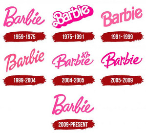
The girls so liked the adult doll with many outfits and accessories that it quickly gained worldwide popularity, becoming a real brand. Its logo appeared simultaneously with the toy, and over the years, it has endured about five modifications. At first, the brand name was written in italics bởi hand, and then it got a different design, as Barbie’s thiết kế expanded.
1959 - 1975
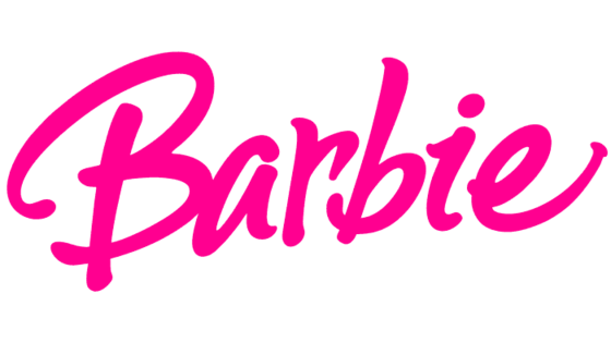
The original emblem is handwritten in a childish and semi-glamorous style. The first letter is uppercase; the rest are lowercase. The lowest is “a,” “r,” and “e.” The upper loop of the một giây “b” in height almost equaled the capital “B.” Thanks to the dot, the “i” sign looks quite large and only slightly inferior to the “b” in size.
The text symbol has two highlights. The main one is jumping letters, which are arranged randomly, and not bởi ranking. They have completely different not only the hàng đầu, đầu trang but also the bottom, which makes the logo perceived as light and laid-back. Such a stylistic device supports a playful mood, airiness, naivety, and charm. An additional feature is a curl at the capital “B.” It is located at the bottom and directed inward, forming a miniature oval.
1975 - 1991
The debut logo was used for thêm than 15 years, after which it was redesigned. An attempt to modernize the brand name led to the emergence of a three-dimensional name – practical, without any background in the form of a joyful mood. The main emphasis is placed on the rigor and shadow that give the word a 3D effect.
All letters in the logo are the same height and are lowercase, except the capital “B.” The line is flat, and the characters are arranged as if in a line. The only thing that dilutes the emblem’s gravity is the inscription going up, as the word is placed diagonally. This technique speaks of a feeling of happiness and the presence of optimism. The most unusual letter is “B,” consisting of two graceful curls. The rest appear elongated and wide due to too large shadows.
1991 - 1999
In 1991, the designers decided to return the logo to the cheerfulness and children’s ease. They eased it bởi removing massive parts. The shape of the letters was left unchanged, removing the extra curls from “B.” This option was perceived much thêm interesting, despite the restrained nghề viết văn style. Lowercase “b” and “i” are now almost the same height.
1999 - 2004
In 1999, the developers of the logo revised it again. As a result, the inscription became italic with a slight tilt to the right. The capital “B” has returned the lower inner curl, which makes it airy and elegant. The word “Barbie” as if written bởi hand in a single stroke, without interrupting the connection between the characters. The color of the logo is close to red.
2004 - 2005
The trước đó version of the emblem lasted only a year, after which it was adjusted. Artists made the first letter sweeping and bold, so the hàng đầu, đầu trang and bottom go far beyond the front legs. Symbols are written without an internal connective and are arranged differently, which is why the name looks galloping. Lowercase “b” received a ponytail, and “i” received a five-petal hoa replacing the dot. So the company management made sure that the logo turned out as childish as possible.
2005 - 2009
After four years of use, the logo was again transformed: the hoa disappeared, and a classic dot replaced its place. The letter “a” remained unclosed and the “e” with the leg extended upward.
2009 - present
Now the debut emblem, approved in 1959, is used. It is accepted without changes and recognized as a reference both in style and in color.







![Taylor [HD]](http://images4.fanpop.com/image/photos/20100000/Taylor-barbie-movies-20194451-500-500.gif)
